DIE CUTS
Ok, so as you know die cuts and die machines have been around for a while. The past few years I have seen more and more people invest in die cut machines, like me. So, this trend is one that will never die and I hope to see more and more of it! :) Let's see some examples!
"Simple Pleasures" by Gael Spence

"Enjoy" by Sheila Burns

"Love" by Lesley Walker

"Enjoy Today" by Cindy deRosier

"Travel" by Tanya Ham

"The Duffers" by Marlene Murphy

RESIN MOLDS
This may not be a totally new trend, but it is one that is popular with scrappers right now. There are these cool molds that you can pour resin into and form neat embellishments. I haven't tried this yet, but I think it looks very cool. Let's see some examples!
"Into the Woods" by Sharon Fritchman

"This way to Serenity" by Sharon Fritchman

"Love" by Gael Spence

THICK FRAMED GLASSES
I think this trend is so cool. We are seeing more glasses pop up on papers and embellishments lately! Even die cuts! Want to create a layout with glasses, let's see Marlene's example below.
"Specs" by Marlene Murphy

DENIM
Denim is a great trend because it incorporates fashion into scrapping. Who doesn't love denim jeans? I think this is great that it has entered the scrap scene. Let's see two examples by Sharon on how to make this trend work on your pages.
"Around the Fire" by Sharon Fritchman

"Summer Camp" by Sharon Fritchman

AROUND THE EDGE PUNCHES
I love punches. I have spent so much money on this trend. Around the edge punches have been around for a few years, but are still super popular. How cool is it to add dimension and detail to your pages by just punching a bit. I love punches that go all the way around!! Let's see some examples.
layout by Lesley Walker

"Friend For Life" by Lesley Walker

"Friends" by Sharon Fritchman

"Sisters" by Marlene Murphy

SOFT COLOR PALETTE
Who doesn't love a page with a soft color palette. I feel like I have seen more and more of this trend. It isn't just for babies and puppies anymore. It works for so many themes. Let's see how!!
"Sisters" by Sharon Fritchman

"Follow Your Heart" by Tanya Ham

"My Dreams for You" by Sheila Burns

"Chenonceau Castle" by Gael Spence

"Love Always" by Dolores Schaeffer

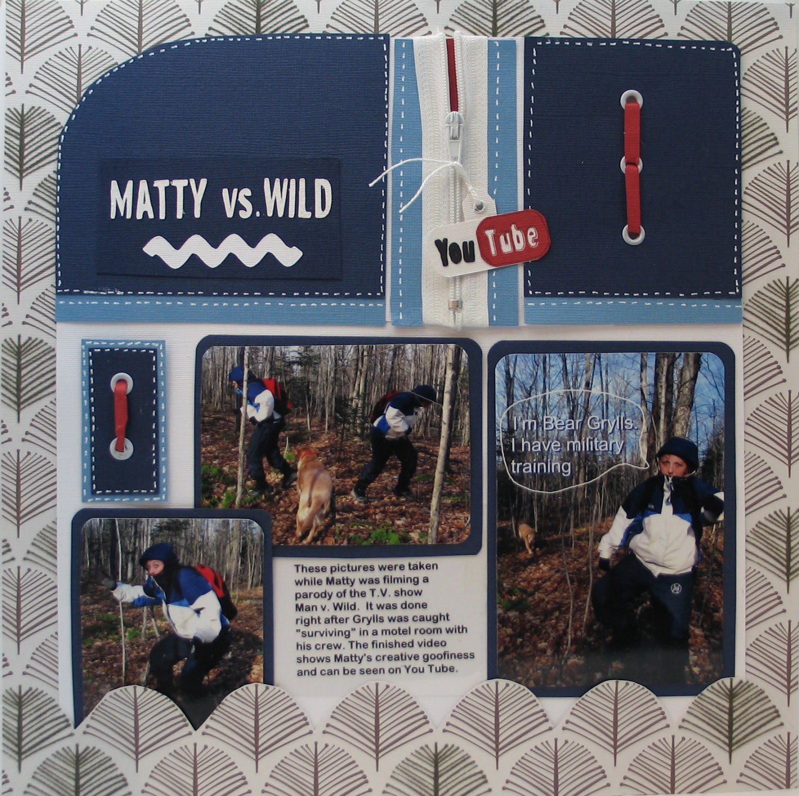
METAL RIMMED BRADS
I have gone ga-ga over metal rimmed brads! I just love the look of them and you can create visual triangles with them and such. I love how the metal rim causes them to pop more. Check this out!
"Spring" by Pam Callaghan

"Easter Egg Drop" by Pam Callaghan

"Matty Vs Wild" by Marlene Murphy
"Just Breathe" by Sharon Fritchman

NEUTRAL BACKGROUND ON LAYOUT
More and more I am seeing a neutral background on layouts. Sometimes it is white, but it can also be off-white, cream, craft, or a soft pink! I know this trend has been around for sometime, but I really wanted to highlight it. :)
"First Day of First Grade" by Cindy deRosier

"Lucky to Have Great Pets" by Dolores Schaeffer

"Together" by Gael Spence

"Anne" by Sharon Fritchman

"Cherished" by Pam Callaghan

USING NEGATIVE DIE CUT SPACE
The last trend, I am highlighting, is one I have seen explode over the past few years! I think it is because die cutting is so easy with machines now. What I mean by negative die cut space is using the space that is cut out and filling it with paper, cardstock or photos in back. This is one trend I hope never goes away!!
"January 2013" by Pam Callaghan

"Hey There Little Guy" by Lesley Walker

"Home" by Gael Spence

"Arm in Arm" by Sharon Frtichman

I hope you have enjoyed this three part trend report! Does this inspire you to create new pages?
VISIT THE CONTRIBUTOR'S BLOGS/GALLERIES
Cathy Dippolito
Dolores Schaeffer
Cindy deRosier
Marlene Murphy
Lesley Walker
Gael Spence
Sarah Routledge
Sharon Fritchman
Tanya Ham
Sheila Burns
Pam Callaghan


